E = Easy on the Eyes
We've all heard the expression: Don't judge a book by it's cover. I bet at some point or another, we've all violated this cardinal rule; whether or not we're all willing to confess to its violation, is another story.
I am willing to confess that a pretty cover does make a difference. I've picked up books, I would not otherwise have touched, based on looks alone. Because something about the cover art appealed to my imagination, sense of intrigue, or emotional center and I couldn't imagine a world where a cover like that could be on a book that was bad.
Sometimes this impulsive and shallow move pays off.
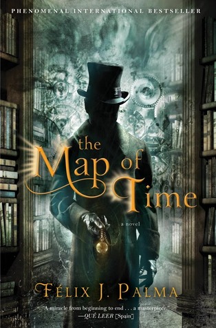 Like with one of my favorites, The Map of Time by Felix J Palma. I picked this book for no other reason than it was nice looking. When I cracked it open, I fell in love with this overly verbose, convoluted tale of ill-fated lovers, time travelers, and dreamers. Sometimes vanity pays off.
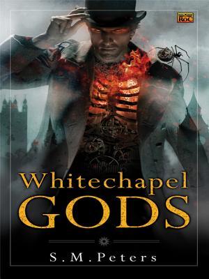 Like with Whitechapel Gods by SM Peters. Will you look at this thing? It's a work of art! The contrast of colors, the detail, the subject... And yet I was mystified by the writing in this steampunk thriller. Unlike the cover, there was no detail in the prose. Things simply were, whether you could imagine them being, or not. And there were gaping plot holes where the author appeared to forget what he was writing about and just kept writing anyways like it didn't even matter. There were grammar and formatting errors which certainly didn't help anything at all.
 The Grind Show by Phil Tucker was pleasantly surprising Indie novel. I won't lie about it's flaws of course... It needed an editor so badly. Run on sentences and spelling mistakes. But the story read like an episode of Supernatural, and the author's vision was so clear that despite offending flaws, I couldn't put it down.
 The Woodcutter by Kate Danley was actually worse than I could have imagined. I read to the 40% marker 3 times before deciding I was never going to know what was going on, who these people were, or why I should even care. More baffling: It won some kind of award. I DNF'd it and moved on with my life.

I am willing to confess that a pretty cover does make a difference. I've picked up books, I would not otherwise have touched, based on looks alone. Because something about the cover art appealed to my imagination, sense of intrigue, or emotional center and I couldn't imagine a world where a cover like that could be on a book that was bad.
Sometimes this impulsive and shallow move pays off.
Like with one of my favorites, The Map of Time by Felix J Palma. I picked this book for no other reason than it was nice looking. When I cracked it open, I fell in love with this overly verbose, convoluted tale of ill-fated lovers, time travelers, and dreamers. Sometimes vanity pays off.
Other times a pretty cover hides a bad story.
Like with Whitechapel Gods by SM Peters. Will you look at this thing? It's a work of art! The contrast of colors, the detail, the subject... And yet I was mystified by the writing in this steampunk thriller. Unlike the cover, there was no detail in the prose. Things simply were, whether you could imagine them being, or not. And there were gaping plot holes where the author appeared to forget what he was writing about and just kept writing anyways like it didn't even matter. There were grammar and formatting errors which certainly didn't help anything at all.
I've also done the opposite: I've selected reading material despite having an unattractive cover.
The Grind Show by Phil Tucker was pleasantly surprising Indie novel. I won't lie about it's flaws of course... It needed an editor so badly. Run on sentences and spelling mistakes. But the story read like an episode of Supernatural, and the author's vision was so clear that despite offending flaws, I couldn't put it down. The Woodcutter by Kate Danley was actually worse than I could have imagined. I read to the 40% marker 3 times before deciding I was never going to know what was going on, who these people were, or why I should even care. More baffling: It won some kind of award. I DNF'd it and moved on with my life.
Sometimes rising above aesthetic appeal works out. Sometimes it doesn't.
Tell me: Have you ever judged a book by it's cover? Were the results good or bad?


Yeah, I'm a sucker for a good cover. I totally would have fallen for Whitechapel Gods. I love the glowing ribcage. Bummer about the story.
ReplyDeleteI can't be the only one who gets twisted pleasure at hearing about other reader's DNF books. I don't remember what it was, but I had one where the MC galloped his horse through the entire night. When he arrived in town he jumped off and smacked it's rump. The author then tells me that the horse is smart enough to find its own way to a stable and bed down.
Umm... No. That was the point where I deleted the file from my kindle.
Fun post!
LOL I might be able to tolerate the horse thing if it were like an elven horse or something magical, but still, what kind of psycho gallops a horse all night and doesn't make sure he's bedded comfortably?
DeleteI find DNF shelves useful at the very least;stops GR from trying to recc it...and illustrates that a one star review is still better than a negative one star review.
A really interesting post and I had to think about my answer here. Yes, I suppose I am attracted to print books by the cover though usually I buy because of author and reviews so go specifically to buy a particular book. But now that Amazon e-books start me at the beginning of the story, I only go back and check on the cover if I particularly like the novel. I enjoy studying and analyzing cover and cover design as an art form but I don't think it affects my book buying at all.
ReplyDeleteAnne at http://www.authorsupport.net
Lol, I never start from the page Amazon wants me to start from, I always go back to the cover. It's not shallowness though, it's more principle. If I bought paperback from a store, I'd start at the beginning. Plus if the author put a foreword in, or if its a fantasy novel there might be maps involved...
DeleteI am so far gone for beautiful covers. I want them to be good so badly and, most of the time, they're not. Confusing storylines, obtuse characters, grammatical errors...the works. I've given up on the pretty covers even though I still pick them up and try to will lovely prose into them to match the cover.
ReplyDeleteBut, just like you, every now and then I find a jewel. And it's happened with good covers and bad covers.
Jessica
2015 A to Z Blogger
Visions of Other Worlds
it's always disappointing when the cover art is so much more advanced than the story.
DeleteIt makes me so sad when something has a cool cover (and description!) and then is not good writing on the inside! Boo for that.
ReplyDeleteI always try to have good writing AND a cool cover :)
~AJ Lauer
an A-Z Cohost
@ayjaylauer on Twitter
In a perfect world there would always be equality of contents, inside and out.
DeleteI often judge books by their covers. I love to go to the library, choose a random aisle and choose a book to read based solely on how attractive the cover is. I have found some great books that way.
ReplyDeleteThat sounds like a fun method!
DeleteI want to read these books now!!!
ReplyDeleteYes, I have to admit I judge books by their covers!! I love creative covers though....ones that are totally out of the ordinary! I have come across some great books!!! Can't wait to read these!!! Thanks!
I love your enthusiasm! Happy reading!
DeleteI've always read books based on awards, reviews, book club selection, etc... The last 6 months or so I've been doing the goodreads seasonal challenge which forces me to choose books that meet very specific rules (some of which make no sense). I do book displays at the library and am amazed by how many books have the same cover (or close to the same cover) but now that I read almost everything on my kindle, I don't even know what my favorite books look like...
ReplyDeleteOne of my favorites, Handling the Undead shared cover art with another book, Rot And Ruin. I remember staring at the two thinking, Am I seeing double? The next year HtU changed its cover art...I always wonder how that happens. Maybe the artists purchase stock from the same seller? Or one 'plagiarized' the other? Coincidence?
DeleteMost of my books come through Goodreads recs these days, regardless of cover...but occasionally there's one pretty one I just have to have...